Customer’s email worst than organization name (maybe make 2 lines with smaller font size?)
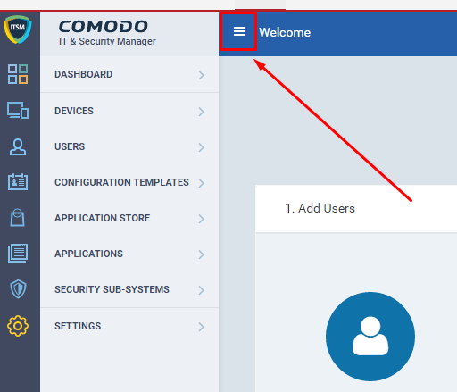
Broken menu line
No comments
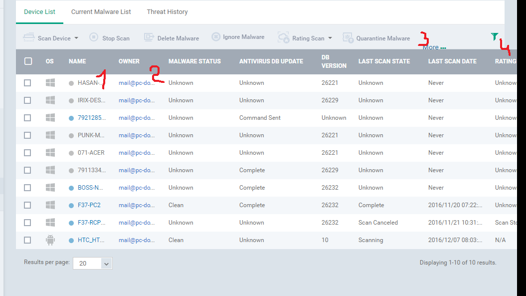
And more - at device page we cant see “Update antivirus base” button, so we must goto to another section, find again this device and then press this button.
We are not experiencing the same issues as you reported. It is true that that using a smaller browser window (or simply a smaller monitor) does seem to narrow the text and then you will need to hover the mouse over it to see it, but can you please answer these questions for a better circumstance report?
what browser have you used for this test
what resolution are you using ?
-also, is it possible to tell us the diagonal of the monitor?
Thank you.
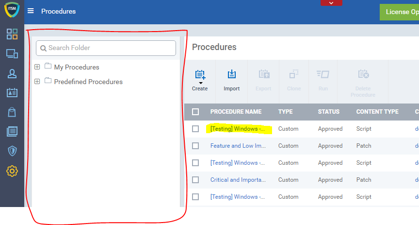
Can I also add that I get this with the procedures screen as well, the navigation pane at the side of that screen takes up about a 5th of the space and the causes all the names to be truncated and I find that sometimes I don’t get the name pop up when hovering which makes it hard sometimes to find a procedure
Sorry should have been clearer, the folder selection pane, as you can see it hides most of the procedure name, if I could hide that when I am not selecting a folder that would help. The other thing would be if the table just expanded to show the full name and had a scroll across that would help